
Conditional Formatting is one of the most powerful features in Microsoft Excel — it helps you visually analyze your data by applying colors, bars, or icons automatically based on cell values.
Conditional Formatting in Excel allows you to automatically apply formatting styles (like colors, font styles, or icons) to cells that meet certain conditions or criteria.
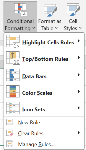
Conditional Formatting Menu Options
As shown in the image, the Conditional Formatting dropdown menu includes several tools:
- Highlight Cells Rules
- Top/Bottom Rules
- Data Bars
- Color Scales
- Icon Sets
- New Rule
- Clear Rules
- Manage Rules
Let’s understand each one in detail
Highlight Cells Rules
This is the most commonly used feature. It allows you to highlight specific cells based on conditions such as:
- Greater Than / Less Than / Between
- Equal To
- Text That Contains
- A Date Occurring
- Duplicate Values
Example: To highlight all marks greater than 80:
Top/Bottom Rules
This option highlights top or bottom performing values in your data.
Options include:
- Top 10 Items
- Top 10%
- Bottom 10 Items
- Bottom 10%
- Above Average
- Below Average
Example: Highlight the Top 10 Sales in a dataset:
Data Bars
Data Bars visually represent the magnitude of a cell’s value through horizontal bars.
The longer the bar, the higher the value.
Example: In a sales column, applying Data Bars shows larger bars for higher sales and smaller bars for lower ones., Perfect for dashboards, financial reports, and trend analysis.
Color Scales
Color Scales apply gradient colors based on cell values — from lowest to highest.
Excel automatically assigns colors, for example:
- Green to Red Scale: Green for high values, red for low.
- Blue to White Scale: Blue for large numbers, white for small.
Example: In a “Profit” column, applying a Green-Yellow-Red scale quickly shows which products are performing best., Great for profit/loss analysis, scores, and data comparison.
Icon Sets
Icon Sets use symbols or icons (like arrows, flags, traffic lights) to represent data categories.
Example:
- 🟢 Up arrow for increasing sales
- 🟡 Side arrow for stable sales
- 🔴 Down arrow for decreasing sales
Ideal for KPI dashboards and trend tracking.
New Rule…
This allows you to create custom conditional formatting rules.
You can define your own conditions using formulas.
Example: Highlight all even numbers:
Clear Rules
Removes all or selected conditional formatting from your data.
- Clear Rules from Selected Cells
- Clear Rules from Entire Sheet
Example: If your formatting looks cluttered, use this to reset and reapply fresh rules.
Manage Rules
This option helps you view, edit, copy, or delete existing rules.
You can also change the order of rules or apply them to other ranges.